From prototype to product
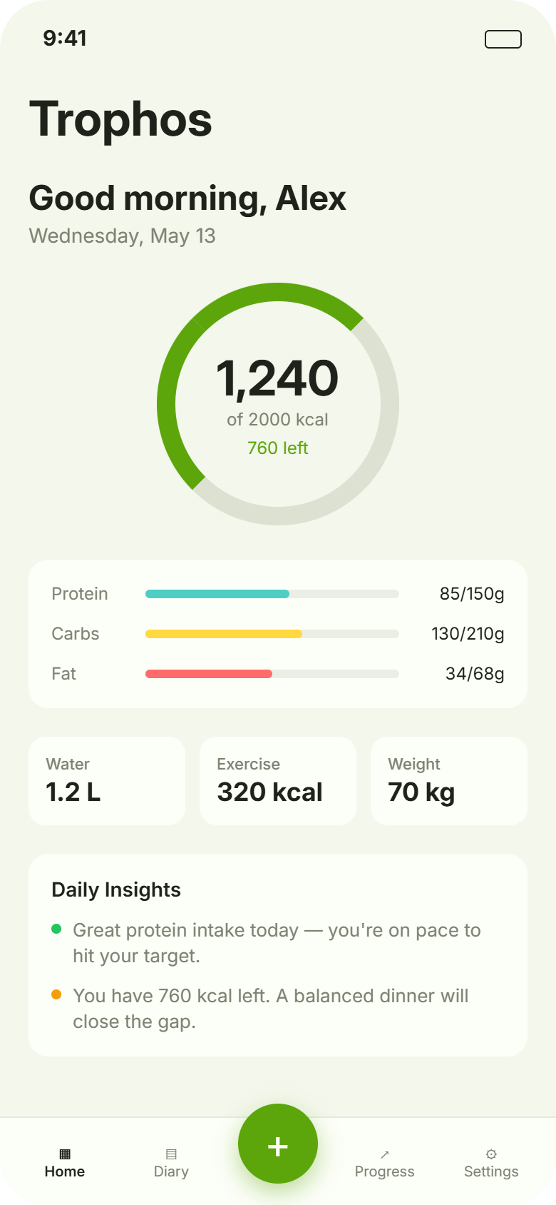
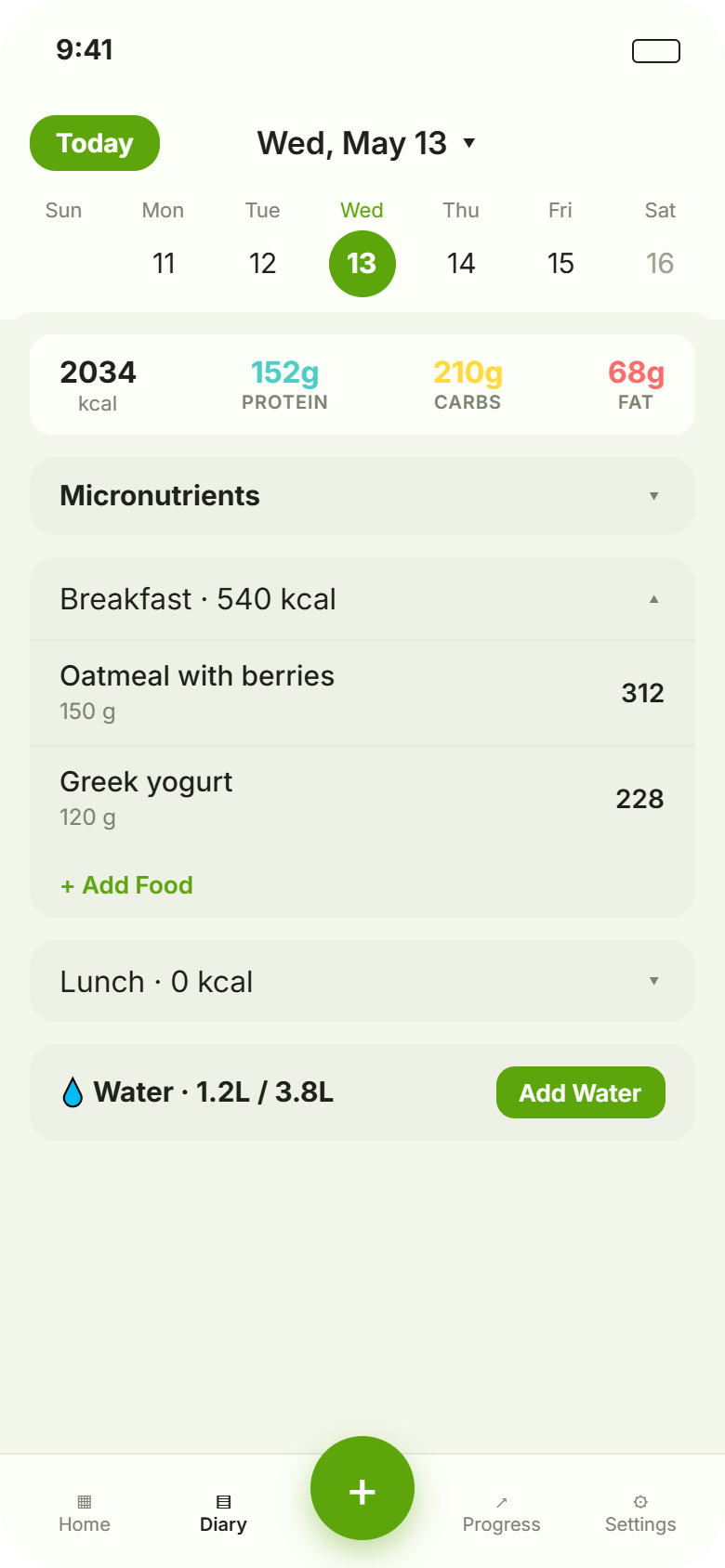
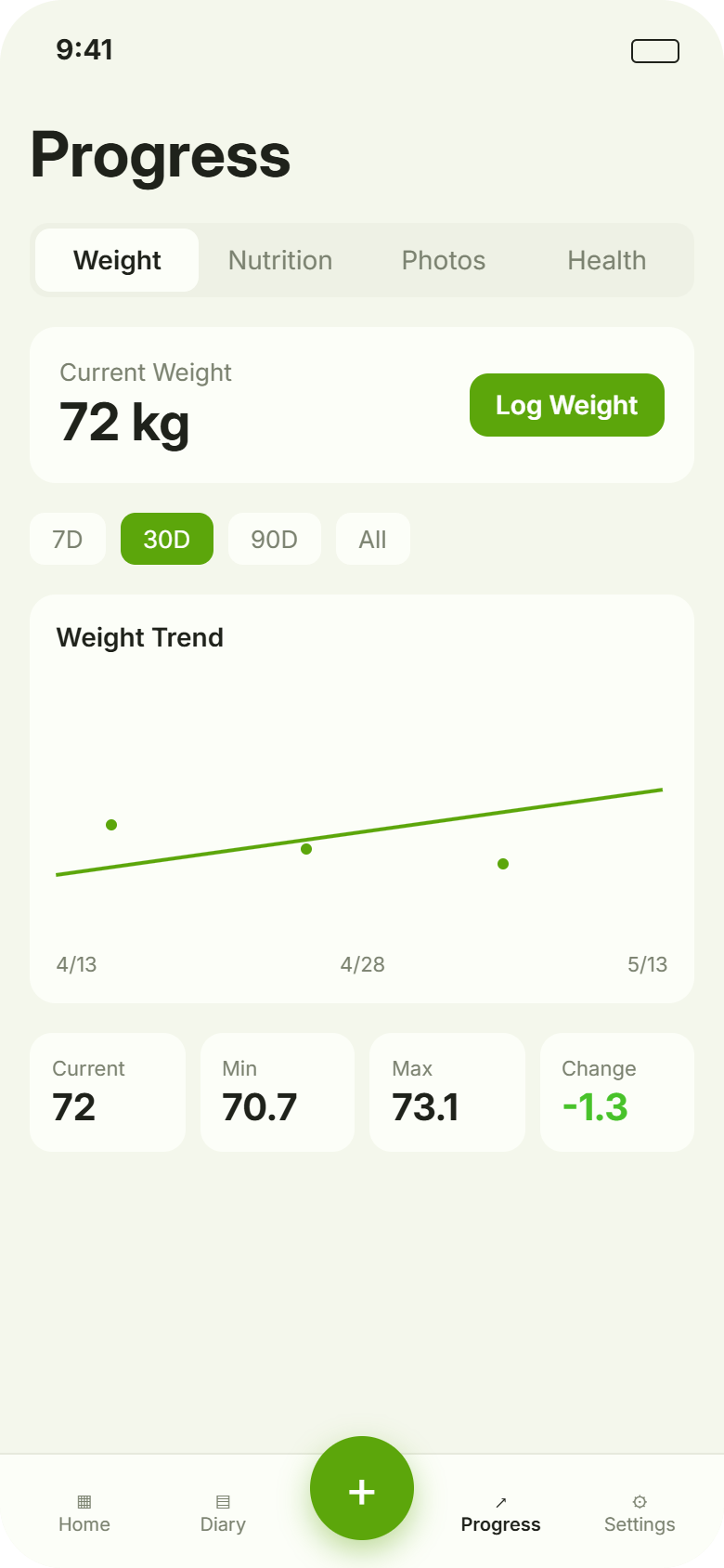
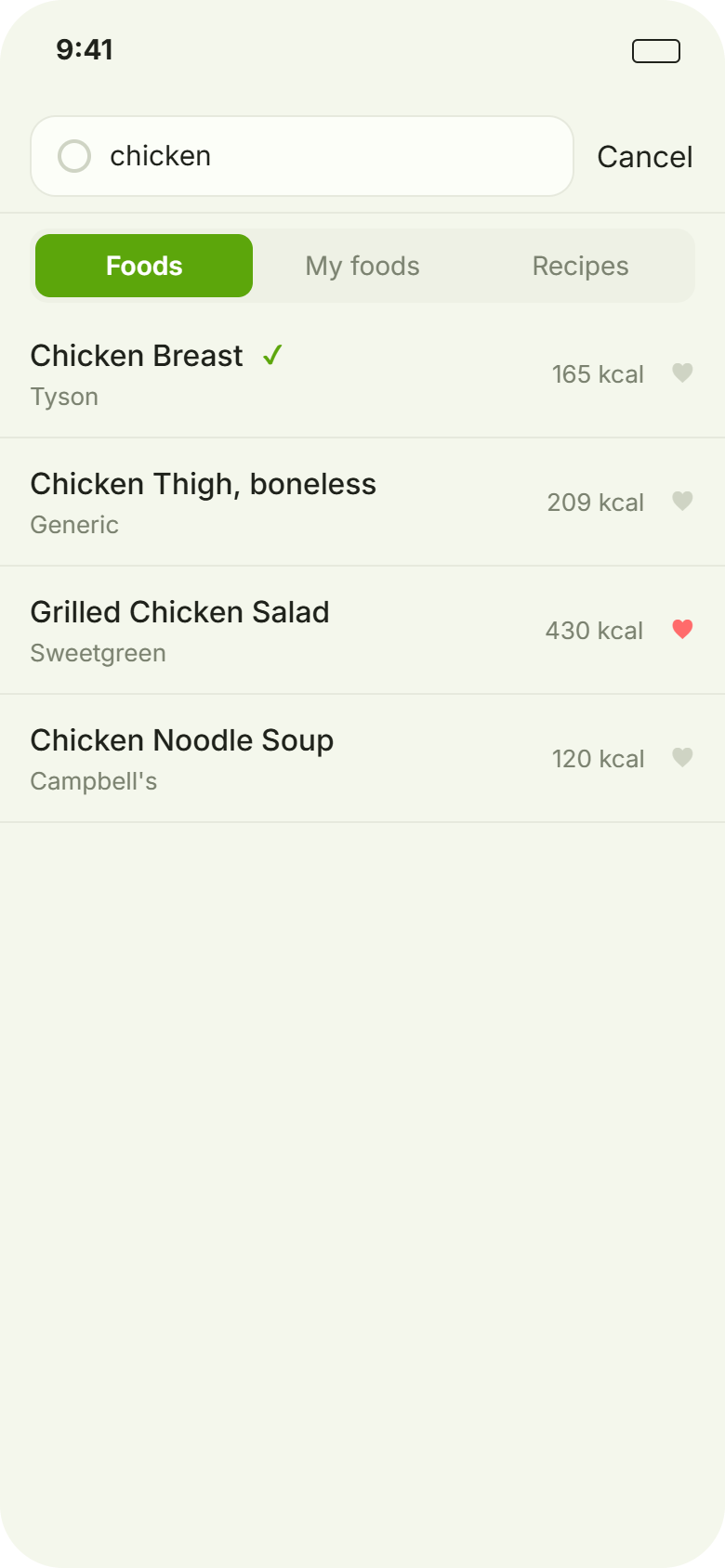
The first version of Trophos worked. It also felt like a first version. The whole app was tinted Garden green, the home screen was built around a calorie ring, and most screens did their job without much character. We kept opening it and feeling a little flat.
Our testers landed on the same thing in their own words. A few of them said it reminded them of the trackers they were already trying to leave. That was the note that stuck, because they were right: we had built something competent that blended into a crowded shelf.
So we set the surface aside as its own project and rebuilt it from the tokens up.
One system, chosen on purpose
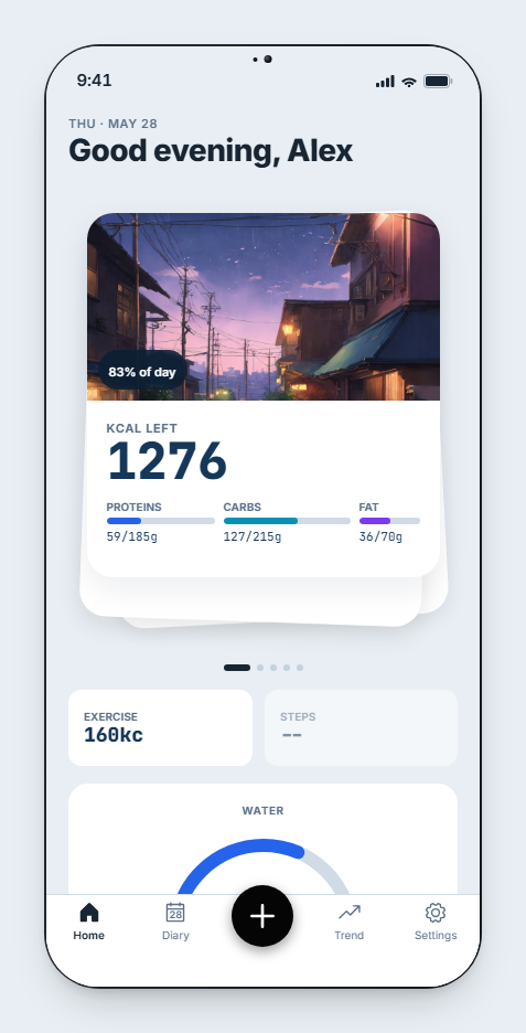
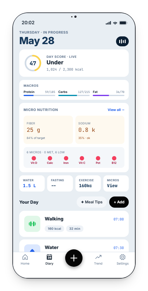
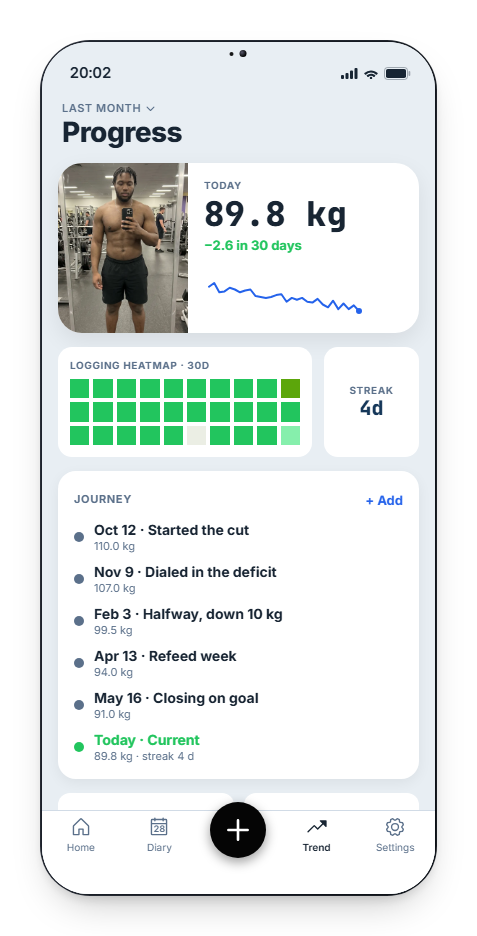
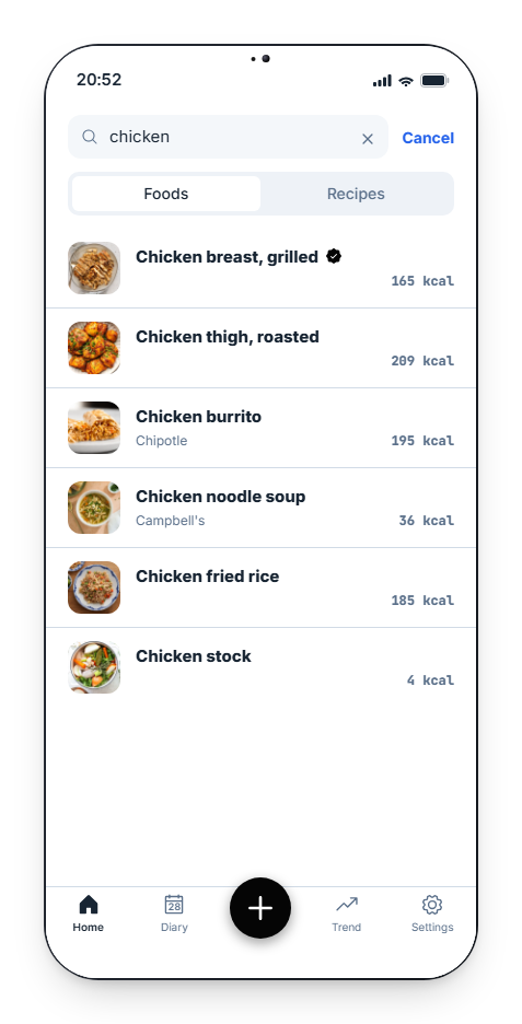
We started from a mood and let it decide everything: maritime. Fog-gray light, deep navy ink, and a single cobalt that does the pointing. Primary buttons go near black so the main action is always obvious, while cobalt stays the accent for highlights and links. Each macro gets its own color, so protein, carbs and fat read at a glance.
Type does the rest of the work. Inter carries everything you read, JetBrains Mono carries every number you scan, with tighter tracking on the big headings.
The screens people live in
We rebuilt the high-traffic screens first. Each one moved from simply showing data to having a clear point of focus.
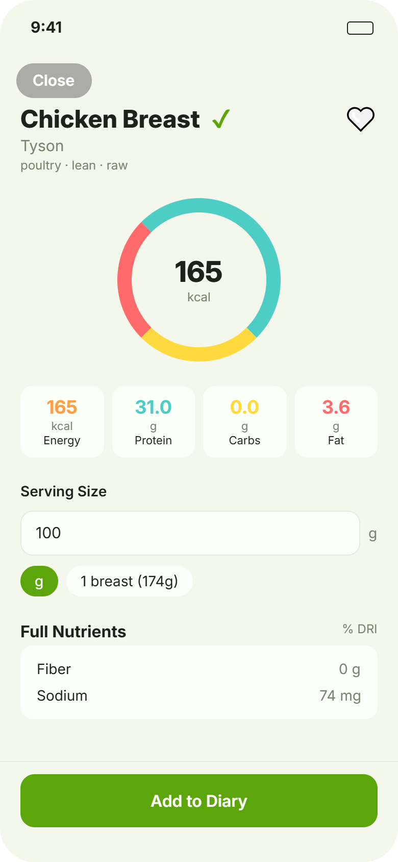
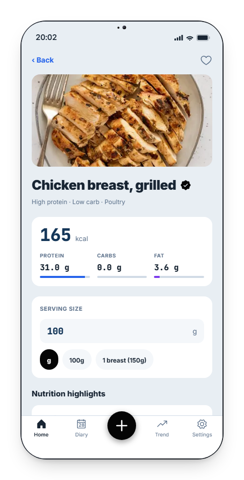
A food model that thinks in meals
We reworked the data underneath too. Foods now split into raw ingredients and ready-to-eat items. Raw ingredients combine into recipes, so a chicken power bowl logs as one item instead of five. Every food also carries a full canonical micronutrient profile, which is what powers the diary's micro read and the trend insights.
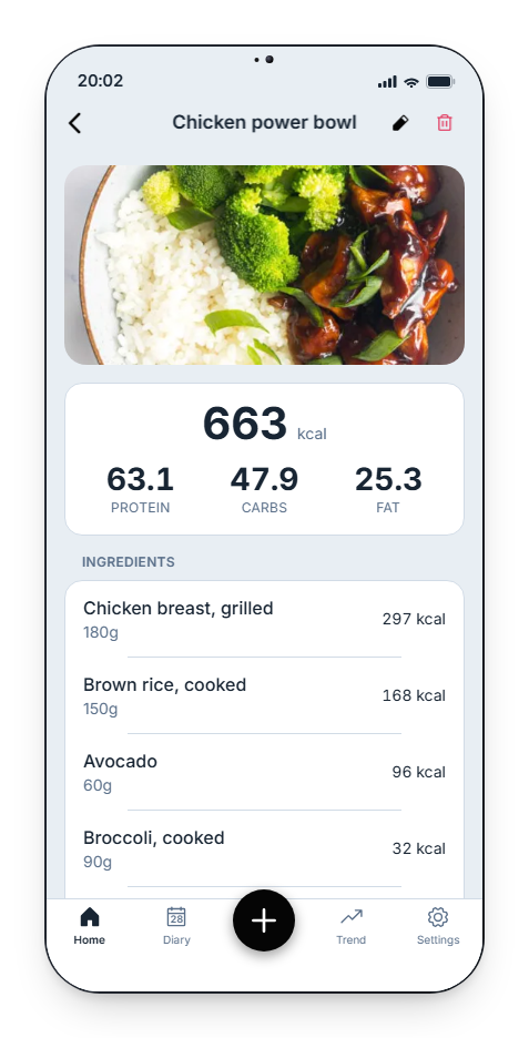
How it shipped in a week
The speed came from a workflow with clear lanes for design, code and review.
We explored directions in Paper, our design tool, and used MCP so the same assistant could read the Paper file and the codebase in one place. Design and implementation stayed in a single conversation, which is usually where time gets lost.
Coding agents then turned the agreed direction into real screens, tokens and seed data, always working against a live web build so we were looking at the running app instead of a static mock.
Everything moved through one path. A Linear issue captured the intent, a pull request carried the work, and an automated review ran on every PR before it merged. We leaned on Codex and CodeRabbit to audit each change on GitHub, flag bugs and catch the small regressions that slip through when you move fast. That review net is a real part of why a week was enough, and why moving quickly did not mean shipping carelessly.
Every screenshot in this post comes straight from that build.
See for yourself
The demo on the homepage is this exact app, running on real data. Open it and have a look.